Overview
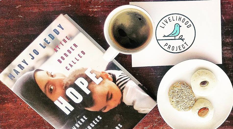
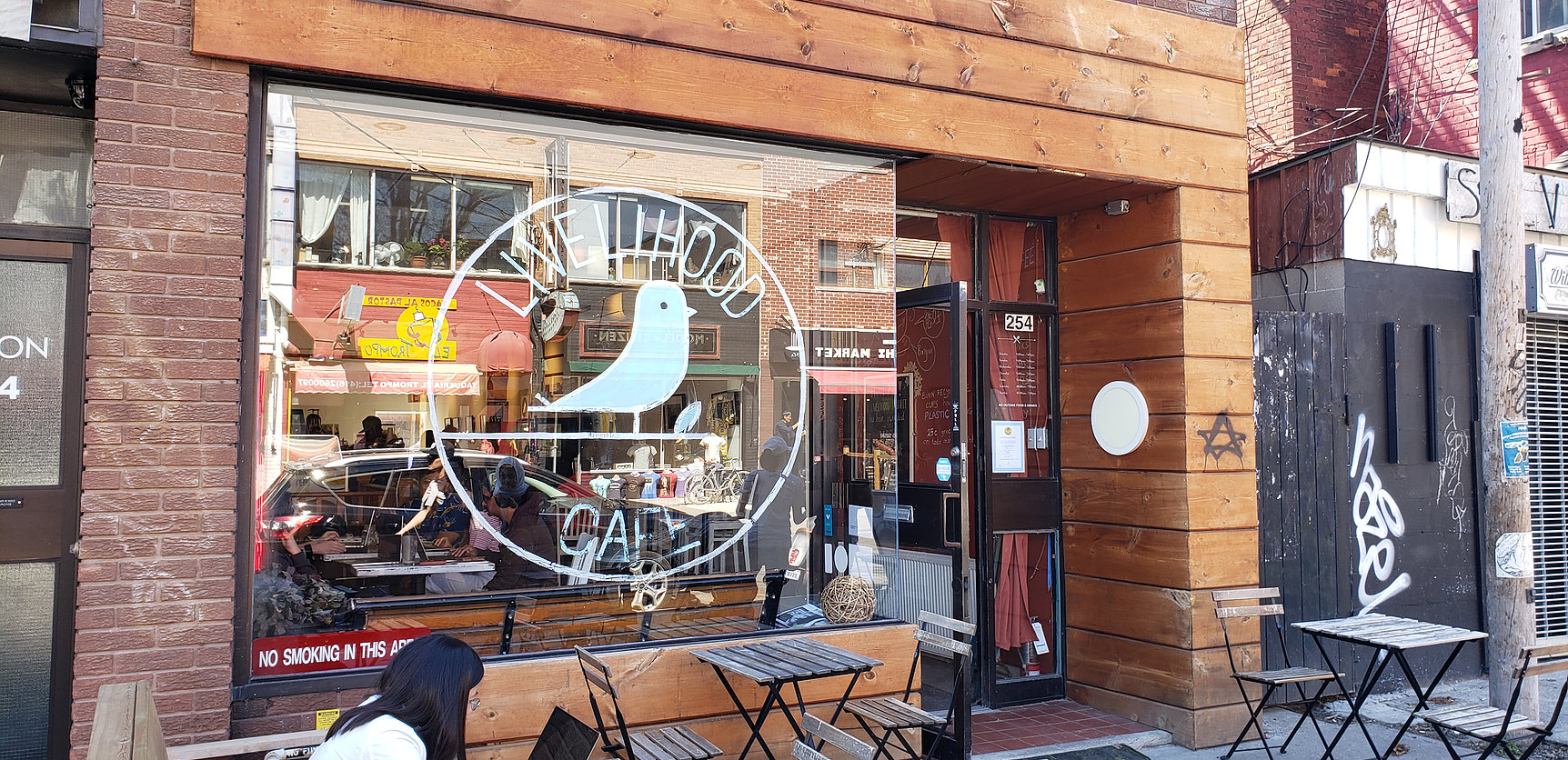
The Livelihood Project is a non-profit/technology startup that works with refugees and at-risk populations to prepare them for the future of employment. The Livelihood Cafe is a home base for the project and a proof-of-concept of a place where refugees can work to improve their ‘future skills’.
As part of our work in a course on Information Architecture, we were brought on to uncover problems and improve the Cafe’s website.
Research
In order to understand the needs of the website and what issues it had, we engaged in a couple of key activities.
Stakeholder Interviews: We worked with the project leader and key members of the cafe staff to clarify the difference between the project and the cafe and what the aims of the cafe’s website were.
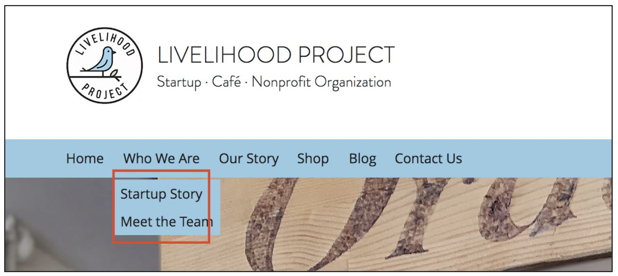
Content Analysis: We examined the current website, both from the user’s perspective and from an internal database perspective to uncover issues.
Usability Tests: Conducted 3 semi-structured interviews and usability tests with representative users in order to understand the website’s pain points.
From these findings we found that the current website’s content labels were confusing to users and the website did not meet the stakeholder’s needs for focusing on online commerce.
Design
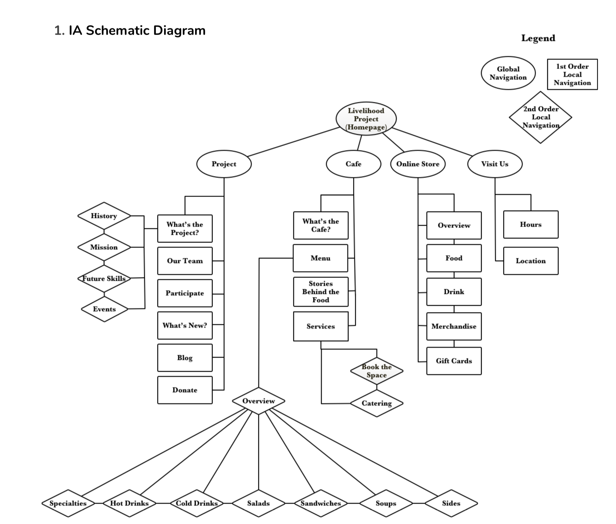
We used our findings to brainstorm how we could improve the labels of the the main navigation menu to create a better user experience. We came up with a set of labels we thought would best explain the website’s content while balancing stakeholder needs and created a schematic diagram to visualize the structure of the new website.
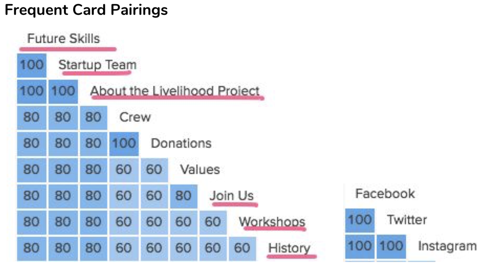
In order to validate these ideas, we did five card sorting exercises with representative users to gather data on how they understood the labels and structure of the website.

Prototyping
Afterwards, we validated our findings with the project leaders and went on to prototype the new website.
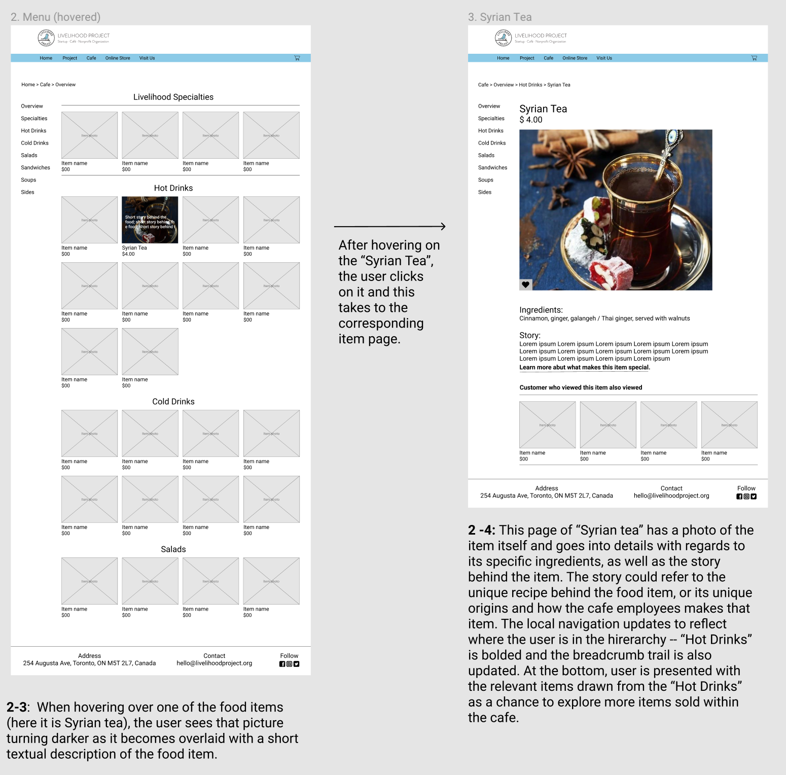
Key features we focused on designing were the improved navigation labels, including a menu section and enhancing the online store product sections.
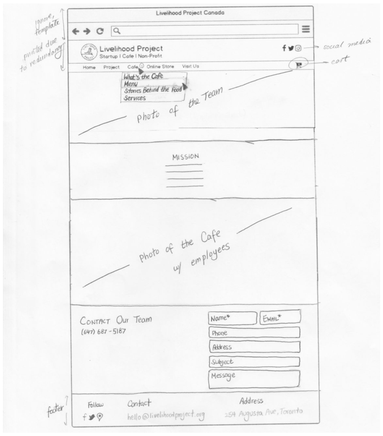
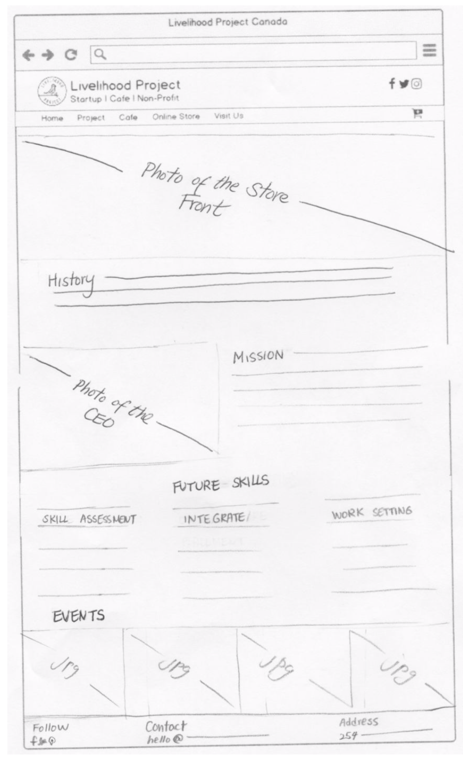
We began with sketches, conducted some rapid user testing and folded those results into our medium-fidelity prototype. The medium-fidelity was built using Figma.
